
Today’s post is a fascinating one, and I promise you’ll learn something from it. I certainly did. 200 years of Safe Withdrawal Rates in one chart!? Is that interesting, or what? (yes, I’m part nerd, but this I find this stuff fascinating.) More importantly, what can we learn from it which will help us answer the all-important question:
How much can you safely spend in retirement?
It’s a question all of us ask, but one we can’t answer without understanding how much we can safely withdraw from our investment portfolio annually. Few have answered the question as creatively as ActuaryOnFire, the author of today’s post. He’s an absolute wizard with numbers, and today presents some fascinating graphics on the topic of Safe Withdrawal Rates (SWR), which is the percentage of your portfolio you can safely withdrawal each year to fund your retirement lifestyle. For example, a $1 Million dollar portfolio at a 4% SWR allows you to spend $40k annually in retirement, and adjust for inflation each year.
Today, 200 Years of Safe Withdrawal Rates in one cool chart. A fascinating look to help determine how much we can spend in retirement. Click To TweetA quick tip: Take some time to study the words that accompany these charts. While the charts may not be immediately intuitive, they display some fascinating information that’s well worth your time to figure out. Slow down, study the numbers. Trust me on this…
Also, while I’m still in italics, I wanted to let you know this will be the last Guest Post of my sabbatical. As you read these words, we are departing the Grand Tetons and heading East. The next post you see will be from yours truly. Thanks for your patience and understanding during The Great American Road Trip!
With that, I’m proud to introduce ActuaryOnFire, and some cool graphs he’s put together to help us think about Safe Withdrawal Rates a bit differently than you may have in the past. Trust me, this is a post you don’t want to miss…

What Does Archaeology Have To Do With Safe Withdrawal Rates?
Over the summer of 2018 did you see any of the photos from the U.K. and Ireland that showed the ghostly imprints of ancient structures on the landscape that were being revealed due to the extremely dry weather they had been experiencing?
With the rise in the use of drones, accompanied with scorching weather that caused any dense vegetation to vanish, the shadows of long-vanished buildings were appearing in sharp relief in fields and hillsides. A number of these discoveries were totally new, whereas some were enhancements of known archaeological sites, but it felt to me like the past was tapping us on the shoulder and reminding us that we are bound to history. Mostly we walk or drive obliviously over the ground unaware of how that land was used in the past, but when a drought reveals a Neolithic monument beneath our feet then we realize that we can’t escape thousands of years of human development.
Digging Through Your Financial Past
Our own personal finances also feature echoes from years ago and all of us are impacted to some extent by the money decisions we made in the past. Credit card debt, student loans or an investment in a failed business venture are all past decisions that may directly impact your financial future. I’m certainly not immune to poor money decisions and have written about my failure with Bitcoin.
More relevant to today’s post is how we can learn from digging through the archeology of our financial past.
An archeological “dig” I recently conducted led to the writing of today’s post…

Finding Some Archeological Gold – SWR Graphics
Over recent weeks I’ve been doing some virtual archaeology of my own and going back through old files and attempting to get things in order on my Google drive. I’m sure you’ve done the same; it’s the equivalent of dusting off a jumble of papers piled on different surfaces and throwing some in the trash or finding storage boxes and labels to make sense of the remainder.
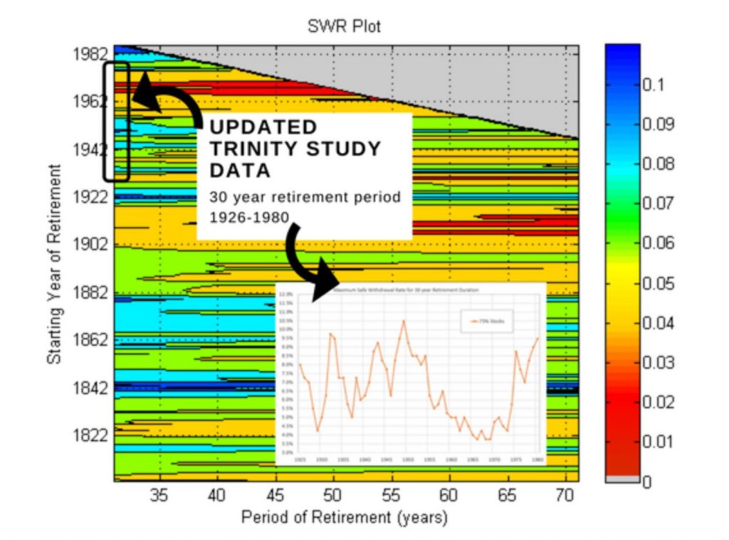
In this process, I came across the following intriguing picture that I had once worked on but later set aside.

Explaining The SWR Plot Graph:
Let me first explain the information in the picture and help orient you.
Each cell is the result of a projection using past historical data, and I can best explain with an example.
Example: trace a line up from the ‘50’ on the horizontal axis, and trace a line to the right from ‘1902’ on the vertical axis. Where they meet the cell is colored orange. If you look at the key on the right that corresponds to about 4.5%. So in other words, if you started with a 4.5% withdrawal of your nest-egg in 1902 and inflation-adjusted this amount for the next 50 years then you would have sufficient funds. A withdrawal in excess of 4.5% and you would have run out of funds, and less than 4.5% you would have some funds remaining.
Note From Fritz: Wow, did you just work through that example? It’s AMAZING the amount of information ActuaryOnFire presents in this one chart. What?? You didn’t work through it? Tsk-tsk. Go back and read the previous paragraph, then follow the “50” and “1902” lines to find the 4.5% SWR…cool, right?
The picture shows all retirement start dates from 1802 to the present, along with retirement periods from 30 years to just over 70 years. Note that the grey triangle at the top is composed of retirement periods that are longer than we have current data. If my last data point was 2019 then the earliest 30 year period was from 1989 – so it’s not currently possible to do a 40-year projection (say) starting from 1989. Hence the grey cells.
Finally, I should note that this example above is for a 75% equity / 25% bond strategy. A different investment strategy would produce a very different pattern.
Building On My Archeology of Safe Withdrawal Rate Research
At one time I had been undertaking my own research into historical safe withdrawal rates (SWR) and produced the chart shown above to illustrate how SWR’s would have changed based on retirement year and period of retirement.
It wasn’t my intention to write a guest post on SWR’s since so much has been done on this subject, in particular, fellow blogger Karsten at earlyretirementnow.com. However, I’m a very visual learner, and I know I am not alone in that respect, so this picture presented me with a challenge. What faint imprints can be discerned from this, and how can that inform how we might behave in the future?
Note From Fritz: I strongly concur that EarlyRetirementNow has compiled the most prolific work I’ve ever seen on Safe Withdrawal Rates. Today’s post is a more simplistic, and visual, summary of this complex subject. If you really want to do a deep dive, I’d encourage you to read his series on the topic.
What About The Trinity Study?
I suspect many of you are familiar with The Trinity Study, which is where the 4% Safe Withdrawal Rate gained popularity. For reference, I have added the black box below to indicate the years of 1926 – 1980, which represent the time frame covered by the study. As you can see, the Trinity study is a small subset of my broader data set, given that my data starts more than 100 years earlier than the Trinity Study.
What Is The Real Driver Of Safe Withdrawal Rates?
In trying to make some sense from the graphs, I began to wonder what is the real driver of Safe Withdrawal Rates? If, for example, it was driven by the year in which someone retired, you would expect most results in the horizontal row representing that year to be a consistent color (which represents the SWR percentage).
I came up with three theories of potential patterns, which are shown below. The “year in which someone retired”, for example, is illustrated in Pattern A:
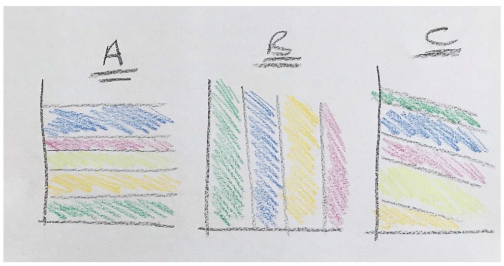
Let’s look at the implications of each of these potential patterns:
- Pattern ‘A’: The Year Of Retirement: If the pattern of SWR’s looked like ‘A’ with horizontal striations then we can deduce that the length of retirement has little impact on the safe withdrawal rate and the biggest determinant is the year of retirement. (Biggest determinant leaving all else constant, like investment and withdrawal strategy).
- Pattern ‘B’: The Length Of Retirement: If the patter contained a predominance of vertical stripes, we could deduce that the retirement period is the key factor. In other words, life expectancy plays a large part and living longer means you have to reduce your SWR.
- Pattern ‘C’: The Ending Year Of Retirement: This pattern groups together all the retirements that have the same ending year. If we saw a pattern like ‘C’ then we would deduce that the ending year was the key issue. Note that this isn’t as strange as it seems since you might assume that the 2008 crash or the Great Depression were severe enough to deplete a retiree’s account and cause the end of that particular projection. Thus the ending year could be important.
I guess a fourth pattern could just be a totally random coloring of cells.
The Primary Driver Of Safe Withdrawal Rates Appears To Be…
So, what can we conclude by this exercise of seeking patterns in my recent archeological find? Let’s look again at the original picture with 75% stocks.

The Answer?
Pattern A – The Year In Which You Retire!
As you would expect with real life the picture is more complex, and none of the potential patterns are entirely dominant. However, it’s pretty clear that A – horizontal stripes – is the predominant pattern.
What this means is that the year you retire is a key (perhaps the key) determinant of your SWR – all else being equal. Even decades into your retirement the imprint of your retirement year comes through in your annual safe withdrawal rate. You may hope for a juicy 8% withdrawal allowance, but if your retirement year puts you firmly in the 4% category you cannot shake that off no matter how long your period is.
What Is The Biggest Driver Of Your Safe Withdrawal Rate? Looking at the data, the year in which you retire seems to be the predominant factor. Click To TweetYou might think this is a fairly interesting result and want to move on. But I want to pause on the significance that these results do not look like chart B – vertical coloring. For most people, this is completely counter-intuitive. Many people would believe that if faced with a 60 year retirement period compared to a 30 year retirement period then they should adopt a lower SWR in order to ‘eke out’ their limited money. If this was the case then you would see vertical stripes go more red toward the right hand side of the chart. But this is clearly not the case.
It also doesn’t play into the actuary’s usual klaxon call warning people that they will live too long. See this excerpt summarizing some research from the Society of Actuaries:
“Running out of money before they die is one of the primary concerns of most retirees. Longevity risk is an even larger concern today as life expectancies have risen.”
If you scrutinize the picture there is some small truth in this. If you follow a row from left to right it does tend to go more orange or red in a number of cases. But I would not say that retirement period is a large determining factor in your SWR.
Finally for chart C: I can see very little evidence that the ending year of your retirement makes a significant impact. There is very little diagonal striping evident and so the ending year seems irrelevant in this case.
Get Your Shovel Out – Let’s Dig Deeper!
I was pretty excited to see this and decided to dig a bit deeper so I went back in history to see what impact certain events might have had on your retirement.

You can clearly see the horizontal stripes relating to major market movements. The Roaring Twenties is a case in point. Had you retired during the brief window of the early 20’s you can see that you would be set up for a very large SWR that is almost impervious to the period of retirement. Whether you lived 30 years in retirement or 70 years in retirement that sliver of blue stretches all the way from left to right.
Note From Fritz: I don’t know about you, but I find this very interesting. I’d have thought that the depression of the early 30’s would have wracked havoc on a person who had retired in the years prior, but the facts don’t support this claim. Still, a case for why you should keep some cash available in the event we do face a depression early in our retirements. It’s a personal decision, but it’s one of the main reasons I’m a proponent of The Bucket Strategy.
Contrast this with the 1970’s – a torrid sea of red and orange!
The Great Depression was a period that would stress early-retirees’ finances but the 1970’s is clearly more severe. Many people worry about drops in the equity market, but really a stagflationary environment that has many years of low to negative real returns from stocks with no diversifying benefit from bonds is the real killer!
Conclusion
I hope you share my enthusiasm for this archaeological view of retiree spending. It’s clear to me that the historical imprint of your retirement year will be left indelibly on your future spending. You can’t escape it, and you can’t outrun it. Based on these charts, the year in which you retire will have a significant impact on your safe withdrawal rate. Unfortunately, we don’t know at the time of our retirement what the future holds, so this analysis is difficult to apply in the forward-facing reality in which we all live. However, it does present clear evidence that we should be very mindful of market returns in the first decade of our retirements, and make adjustments in our spending if warranted.
A Note About Sequence Of Returns: I didn’t intend to get into the technical details here, but a key factor in the overall level of a SWR is the “sequence of returns risk”. There was a time when this was my favorite subject and I wrote extensively about it; Mathtastic Advice on Sequence of Returns Risk, Reprise! Sequence of Returns Risk and Introduction to Sequence of Returns and Buying a Boat in Retirement. The impact on your starting year, and in particular linking with equity valuations via the CAPE has been explored by Early Retirement Now.
But seriously, don’t get me started on these topics or we will never finish and I’ll still be going when Fritz gets back!
Note From Fritz: As much as I’d love to have you take over my blog, AoF, I think it’s time for me to return to my keyboard. Thanks for a fascinating study into the history of SWR’s. You’ve given me some things to think about, and I expect the same is true for my readers. Thanks for helping me to enjoy my sabbatical, and I look forward to hopefully meeting you at FinCon in September!
Author Bio: I started actuary on FIRE as I did not see any actuaries taking a prominent role in the personal finance area and wanted to remedy a shortage of actuary jokes and write for those that appreciate rigor with fancy charts. In my day job I advise corporate America on investment and retirement strategies. I am a qualified actuary, a registered investment adviser and have a PhD in mathematics and I reserve the right to include the occasional math post. Actuary on FIRE is not actually on fire (yet) but blogs at actuaryonfire.com and by day provides investment and pension consulting to corporate America.
One More Note From Fritz: Ok, you asked for it: An actuary, an underwriter, and an insurance salesperson are riding in a car. The salesperson has his foot on the gas, the underwriter has his foot on the brake, and the actuary is looking out the back window telling them where to go
By the way, AoF has recently released a new online course – Create a kickass financial independence spreadsheet and The Retirement Manifesto readers can enjoy a limited-time discount of 50% with code FRITZ50
PS – Notes On My Data: I used a slightly different data set to the Trinity study. They used corporate bonds and I have used Treasury bonds. When I match their results I get slightly different results, but this detail is not important for this post. Also, note that I took some equity data that captures the early 19th Century. This is quite contentious data with limited use, since really at this point in history there were only a few railroad and bank stocks in existence. In addition, the inflation data from this early period (note all my returns are ‘real’ returns) is basically formed from an index of prices paid by Vermont farmers for family living! So for the really early historical results you will have to take them with a pinch of salt!
Wow, cool stuff AOF, nerdy and informative. It makes sense that the year you retire is the most important because sequence of returns risk could really throw a nasty fly into your numbers. Great post!
Dave – thanks for dropping by and commenting!
Thanks for sharing this! Really underscores the fact that the year you FIRE is what matters because of sequence of returns risk early on. My plan is to be flexible with spending, be willing to geo-arbitrage, and keep income flowing from online side-hustles to offset poor returns years early in FIRE.
Peter – good summary of ways to mitigate the risks. Agree completely. Thanks for stopping by.
Great post I often write that the Balanced Growth model is the sweet spot for accumulation and decumulation. Nice to see that repeated, again and with some great research. We are in that Balanced Growth mode.
Thanks, Dale
This is SO COOL!! I really did think length of retirement would have the biggest impact. Thanks so much for showing me otherwise! Not that I need more confidence (some would say I have too much…), but I’m now feeling even better about my retirement plans next year so thank you 🙂 !
I love that you think this is cool! You can join actuary-club (but don’t tell anyone about actuary club).
Thanks for visiting.
Wait…what?? There’s a secret club?!
I would like to see the retirement years grouped by SWR (1%, 2%…) and then see what the interest rate and average stock returns were in the first 3 years, 5 years, 10 years after the retirement year. It’s not the year you retire that matters, but the economic climate at the time you retire. So what are the broad economic indicators that might tell you what your retirement years will be like and what your SWR is.
Chris – very fair comment – it’s the behavior of the years following retirement that matter. That’s really captured by the CAPE at the time of retirement. There is a good linkage between the valuation of stocks and the next ten years’ of returns. However this is now treading over the ground that Karsten has explored which I purposely did not want to repeat…
So thanks for pointing that out and reading the article.
Given the low and (potentially permanently low) interest rate environment we are in one has to wonder whether CAPE ratios are still the best way to evaluate risk. We may be looking at long term market revaluation (and for good reasons, because where else can money go in such an environment)?
Nice article, no fluff in this one, Except for Fritz’s. TSK TSK, thankfully I did do the exercise and did not have to be sent back by the principle to do my homework.
I am surprised to see so little red on the chart, Karsten’s great piece of work on the subject predicts a SWR closer to 3% or lots of red, very few years had to go that low. I, like Fritz, prefer a more redder, fatter, SWR but in a very blue year.
Oh Dear God please make 2019 and Baby Blue year.
Fritz, Safe Travels, looking forward to your return.
Rick – there’s nothing here that contradicts a ~3% SWR – let me explain.
Usually when we (including Karsten) talks about an SWR we talk about what the safe withdrawal would have been historically for a 30 year period, or a 50 year period, or… And the answer is ~3%.
In my chart this is equivalent to taking a vertical slice at point 30 or 50 or…etc
In any of those slices you can see that they go through at least one red dot. Even the 30 year vertical slice will hit at least one red dot, and so we conclude that the SWR for a 30 year retirement period is ~3%.
Make sense?
I love the comment – make it a Baby Blue Year! I wish we had made that the title of the post!
Excellent chart(s). Excellent post. Excellent information.
Excellent^3
I like it!
So for an encore AoF set up 2 portfolios. One is a big portfolio risked at 75% equities. The other a small portfolio of 3 years WR risked at 20% equities. Choose a trigger like a 30% drop in the market. When the trigger is pulled live off the 20% portfolio till it’s out of money or until the market rebounds. This effectively re-indexes the retirement to a different retirement year. The portfolio is always re-balanced. My study shows you only need do this once in the course of 30 years to change the outcome. This also worked in the 73 recession.
Great article as always
I knew I could tempt you into the comments with this article!
You present an interesting proposal here. I may have to dust off my data.
It’s a masterful piece of data AoF, deserves a serious comment!
Can you clarify what the abbreviation WR means? I’m assuming 3 years living expenses?
WR = yearly withdrawal rate, usually fixed like 4% or 3.5% but could be a variable as well.
An additional twist, If a 75% stock portfolio has a 11% SD be willing o reduce WR by 11% while the 20% portfolio is being spent extending the effective period of the small portfolio. In your graph it would effectively move you up in the sequence reducing SORR during the critical initial period. This is a one shot, no need to refill the bucket. It is a system that diversifies risk
this is a good article. the thing that drives me nuts though is there seems to be some assumption that when you retire you take a pin and prick your finger while deciding on a withdrawal rate. then you sign up for a lifetime of that w/d rate in blood, never to veer from that pledge. there also seems to be some assumption that you spend every last dime withdrawn every single year instead of holding a little back and increasing that cash buffer as time goes on. hell, after a great market year with a 30% gain you might decide to take out a 2-3 years worth of funds. there is also some quirky assumption that if you pick the wrong rate you will disintegrate and cease to be.
all that being said i do enjoy the math.
Freddy – you’re right this is a bit of a dry mathematical exercise. However Karsten has looked at all sorts of variations like the ones you describe and Fritz has written about a cash buffer in his investment strategy.
You can also check out my FI spreadsheet course that I did to allow precisely the flexibility you describe. (shhh I had to get a plug in for the course before Fritz returns…)
Very interesting. That’s why I think it’s best to work part-time for a few years after retirement. If things worked out well, you can ride off into the sunset. If it’s a bad year, then you can put off withdrawal until it gets better. Having 4-5 years of income buffer zone will help you alleviate the dreaded Sequential of Return risk.
Joe – I’m with you on that. I personally like the idea of phasing down paid work for the financial reasons you describe and the psychological impact.
This absolutely brilliant work. I would love to see a follow up graph which dissected the red, orange and yellow colors further if possible. I completely understand that the graph is a “big picture” view of history but it would be great if you could drill into the 2% to 5+% range further and differentiate these ranges. I think most people are realistically targeting something in the 2% to 5% range.
Any hope of seeing this is a future post??
Excellent work! Fritz, you have a tough act to follow as you arrive back from your road trip. 🙂
Crusher – thanks for the kind words! Look out for a follow up, but it may not go in the direction you describe….
Ohh, very excited!!!!
Let me take this opportunity to publicly thank Fritz for letting me guest post. It’s an honor on such a prestigious blog and great to be welcomed by his super-engaged crew.
I’ll even forgive him sneaking in that actuary joke! So let me leave you with my favorite;
How can you tell when you meet an actuary who is an extrovert?
He is the one who looks at YOUR shoes when he talks to you!
Methinks this is very important to see. //Finally, I should note that this example above is for a 75% equity / 25% bond strategy. A different investment strategy would produce a very different pattern. //
Bill – you’re right! Which is why I have another article in my drafts folder that discusses alternatives. Stay tuned…